That sage green and navy blue combo? Pure magic. It’s like the design gods took “calm” and “sophisticated” and blended them into one flawless palette. But nailing this look requires more than just throwing paint at walls—it’s about balance, texture, and a dash of daring. Here’s how to make these hues sing together.
1. Start with the Right Undertones
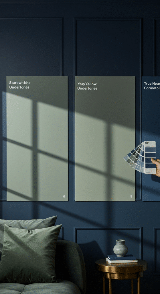
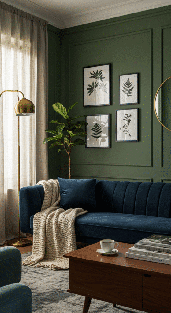
Not all sage greens are created equal. Some lean gray (cool and modern), others yellow (earthy and warm). Pair a gray-based sage with navy for crisp contrast, or a warmer sage for cozy vibes. Navy’s depth makes sage feel fresher, while sage softens navy’s intensity. Pro tip: Test swatches at different times of day—what looks muted at noon might glow at sunset.
2. Choose Your Anchor Piece
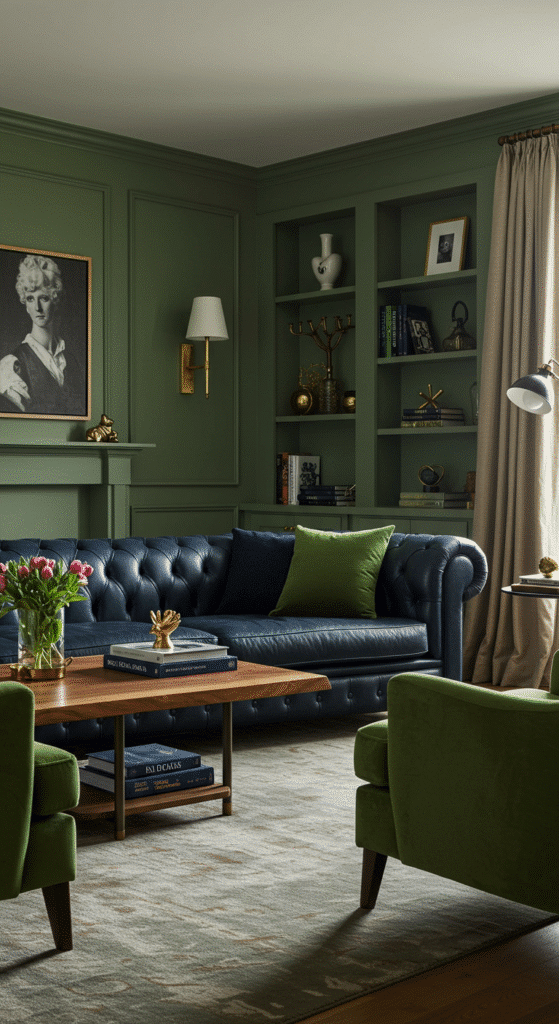
- Option A: Navy sofa + sage walls = timeless elegance
- Option B: Sage sectional + navy accent wall = modern edge
- Option C: Mix both in furniture (navy armchairs + sage couch) for a collected look
Design hack: Matte finishes on walls let velvet or leather furniture shine without competing.
3. Layer Like a Pro
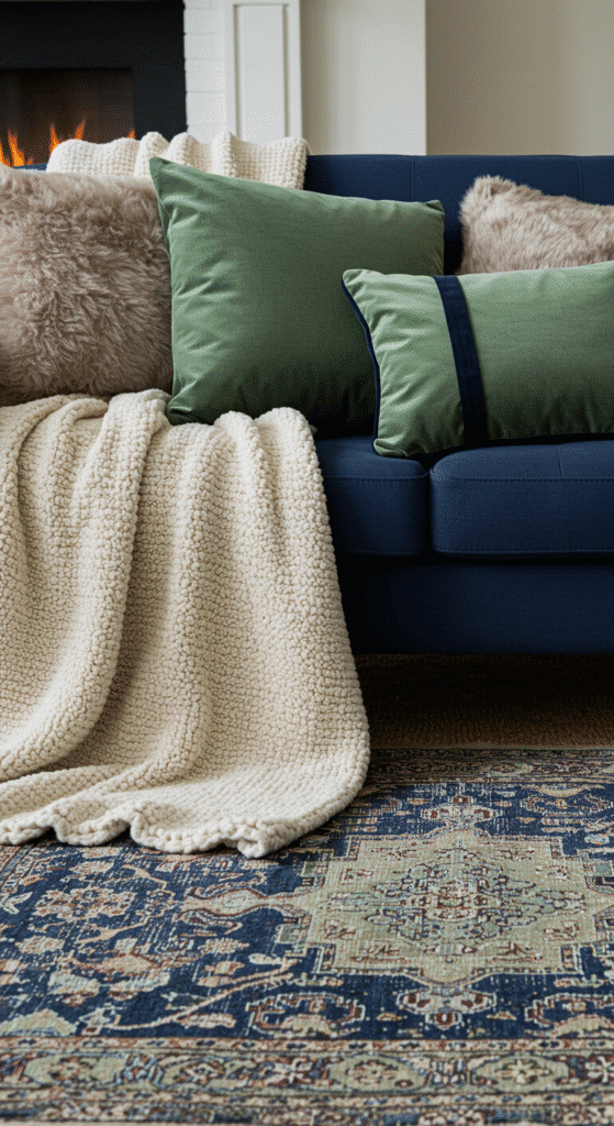
Texture is your secret weapon:
- Pillows: Navy linen + sage velvet + cream knit
- Throws: Faux fur in cream or a chunky wool in charcoal
- Rugs: Jute for boho, Persian for trad, or graphic black/white for modern
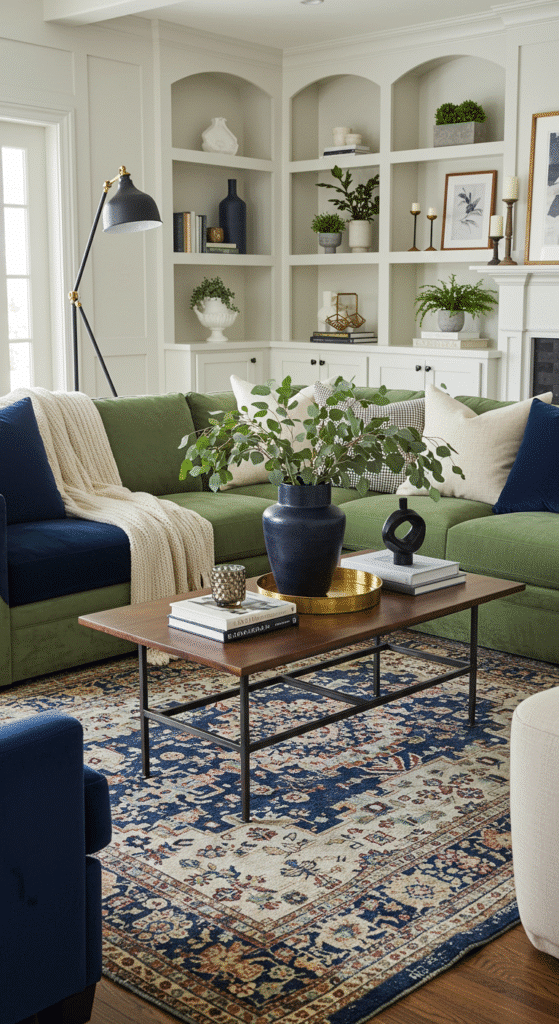
4. Metallics Matter
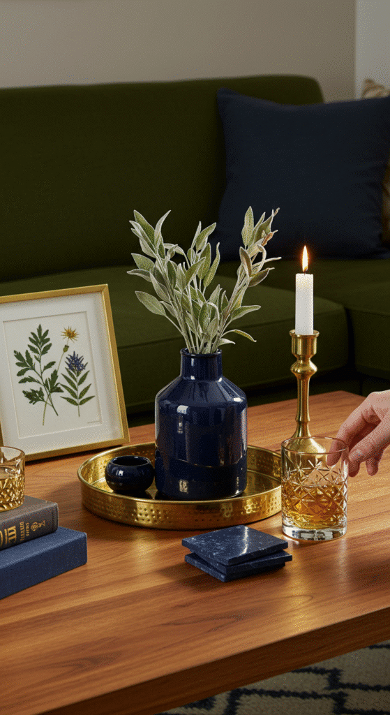
Gold or brass = instant luxe (think lamp bases, picture frames)
Black iron = industrial edge
Avoid silver—it clashes with sage’s warmth
5. The “Third Color” Rule
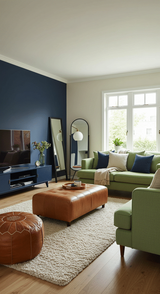
Neutrals keep things from feeling matchy-matchy:
- Warm: Cream, oat, caramel wood tones
- Cool: White, gray, black accents
- Pop: Mustard yellow or terracotta for energy
6. Lighting Sets the Mood
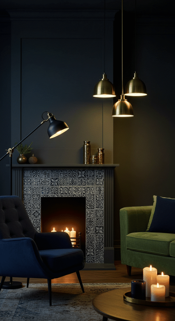
- Overhead: Skip the harsh fluorescents—try a woven pendant or drum shade
- Task: Brass swing-arm lamps by seating areas
- Ambient: LED strips behind shelves or a cluster of pillar candles
7. Art That Bridges the Gap
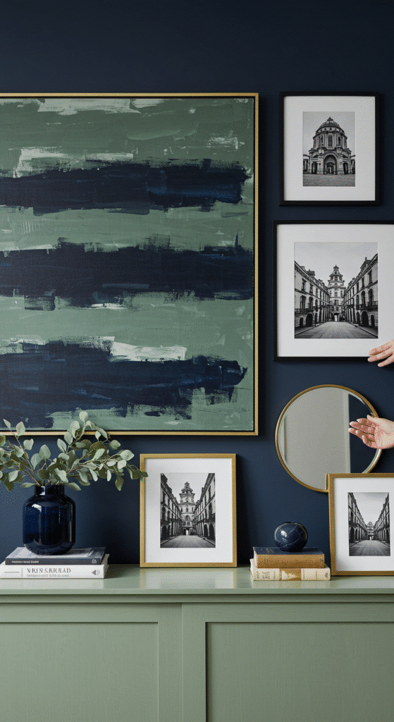
Abstracts with both colors, vintage botanical prints, or a oversized black-and-white photo in a walnut frame. Gallery walls? Space pieces 2-3 inches apart for breathing room.
8. Greenery is Non-Negotiable
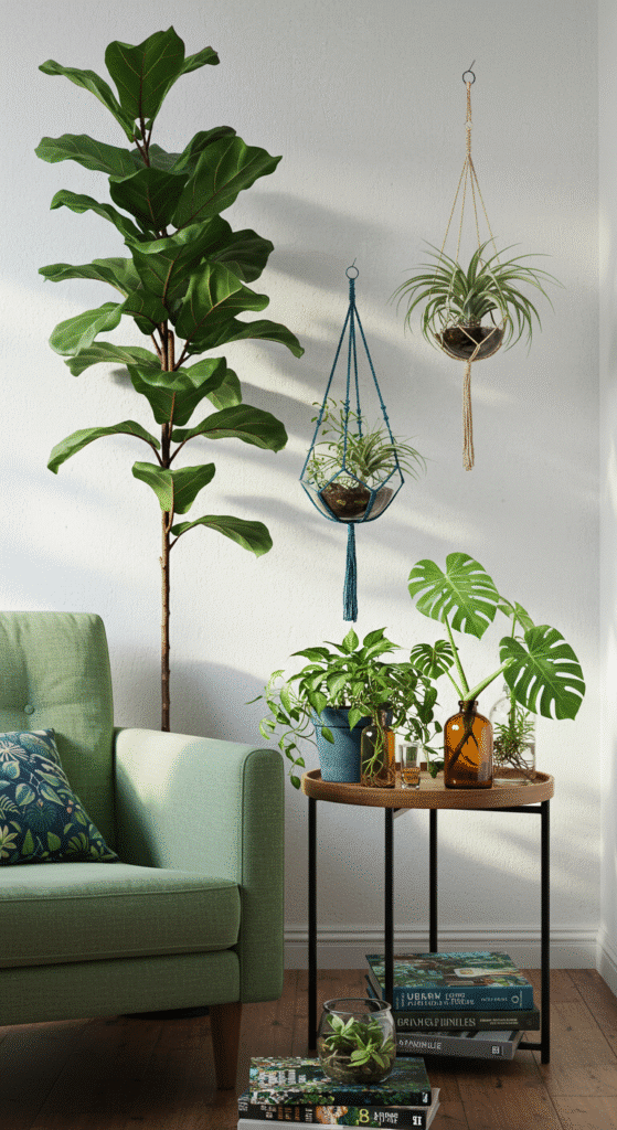
A fiddle leaf fig in a terracotta pot, eucalyptus stems in a vase, or even a preserved moss wall art piece. Sage green loves its plant cousins.
What to Avoid
- Too much pattern (stick to 1-2 statement prints)
- Matching furniture sets (mix eras for depth)
- Ignoring natural light (north-facing rooms need warmer sage tones)
Seasonal Swaps
- Summer: Linen slipcovers + seashell decor
- Fall: Wool throws + pumpkin-hued pillows
- Winter: Velvet accents + metallic ornaments
- Spring: Fresh branches + pastel ceramics
This combo works in everything from studios (paint just one navy accent wall) to open-concept homes (use sage on lower cabinets, navy on an island). The key? Let one color dominate (70%), the other support (25%), and neutals fill the rest (5%).
Final Thought: Sage and navy aren’t just colors—they’re a mood. Serene enough for lazy Sundays, sharp enough for cocktail Fridays. Now go make your space the envy of every Pinterest board.

Selena is an experienced lifestyle blogger and the voice behind many of Cozy Toned’s inspiring posts. With a passion for mindful living, home styling, and everyday wellness, she shares practical tips and fresh ideas to help readers live beautifully and intentionally.